Friday 24 January 2014

Ancillary Text: Process of creating my Digi Pak (Second Edit)


 From looking at the type of typography Disclosure has on their CD they have it is capitals and contrasting colours. The type is quite long and its type that is a genre convention of house music. I coloured the type in contrasting colours like they have done and to reflect the importance of the masthead.  


I then edited the image by clicking on image, adjustment and then colour balance. I created a mucky type of edit because there CD colour was represented like this. A type of retro and genre convention.


 Here is the tool that comes up which I then moved around to find the right colour balance.


This is my final edit for my Digi Pak Front cover. 


Thursday 23 January 2014

Ancillary Text: Process of Creating my Digi Pak (First Edit)


These are the two images I have taken from my music video and I am going to use them in my Digi Pak. I chose these images as they are resembling the love and connection between each other and they are direct to the audience as they are looking into the camera.


From researching the artist I am recreating the music video for, Disclosure I found that have their own unique style which instantly relates to them, like their own personal logo. And that is this white stencil of a face below.  For all their posters, CD designs etc they have this logo presented over the face of the person. So I am going to do that on my Digi Pak to create realism in my Digi Pak to how it would be if sold. 

To create this face stencil I had to use the software Photoshop and the 'Polygonal Lasso tool' which helped me recreate this face design. I basically copied the stencil and then using the 'paint tool' I coloured it in white. 


Here I have placed it over my image and this is replicating the Disclosure design. Straight away the audience will know that it is the artist Disclosure as this image is very well known and significant to them.  This will be the front design for my Digi Pak but I still have more work to add to it. Such as typography and maybe some effects.


Tuesday 21 January 2014

Research into Disclosure's CD

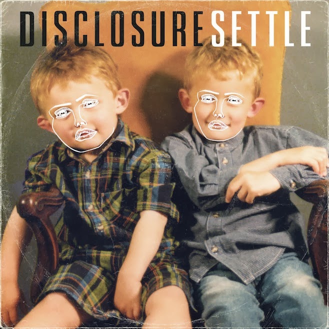
Here is the actual Cd cover and Back cover of their Album 'Settle'. I have decided to look at their CD covers so I can get an idea of the type of formal conventions they use. For example the typography, colours, angle and framing of the image etc. I found that they have a type of distinctive logo represented over the faces. This shows the audience straight away who the artist is without even needing a masthead to say who the artist it. It is a very distinctive image that represents the artist and has a meaning than just for display. It could be implying that their music is hypnotizing the audience listening. That it makes every have this type of personality turned on when the music comes on. 
There use of typography is very striking and has been reflected in 2 contrasting colours, black and white. This creates the mast head to leap out at the viewer as the contrasting colours make a pure statement. The artist disclosure is 2 brother who are DJ's and the image used on the front is showing that 2 young boys who are brothers.  The image is quite battered and worn a little, showing that its old and there's some aging. This can link in with the two boys are now grown up and this is an old image of them. Furthermore it links in with the conventions of the genre. House music genre conventions are reflected as retro, worn, and unique. For example graffiti is a genre convention for house as that's what is represented for this genre and I found this when I did my textual analysis. 


The back cover is very plain and simple but it gets the message across, the songs listed in this album. That is the main message as the background is very bland from the use of image and colour. The typography is in the colour white, which contrasts against the darker background. The writing is in capitals and this is clearly to make a statement and make them stand out more. They have an intro song for the first song on the CD and this is to introduce the listener to their album. Give them an idea what their music is about and what it sounds like.