Monday, 3 February 2014

Ancillary Text:Digi Pak (Back Design and Other Sides)


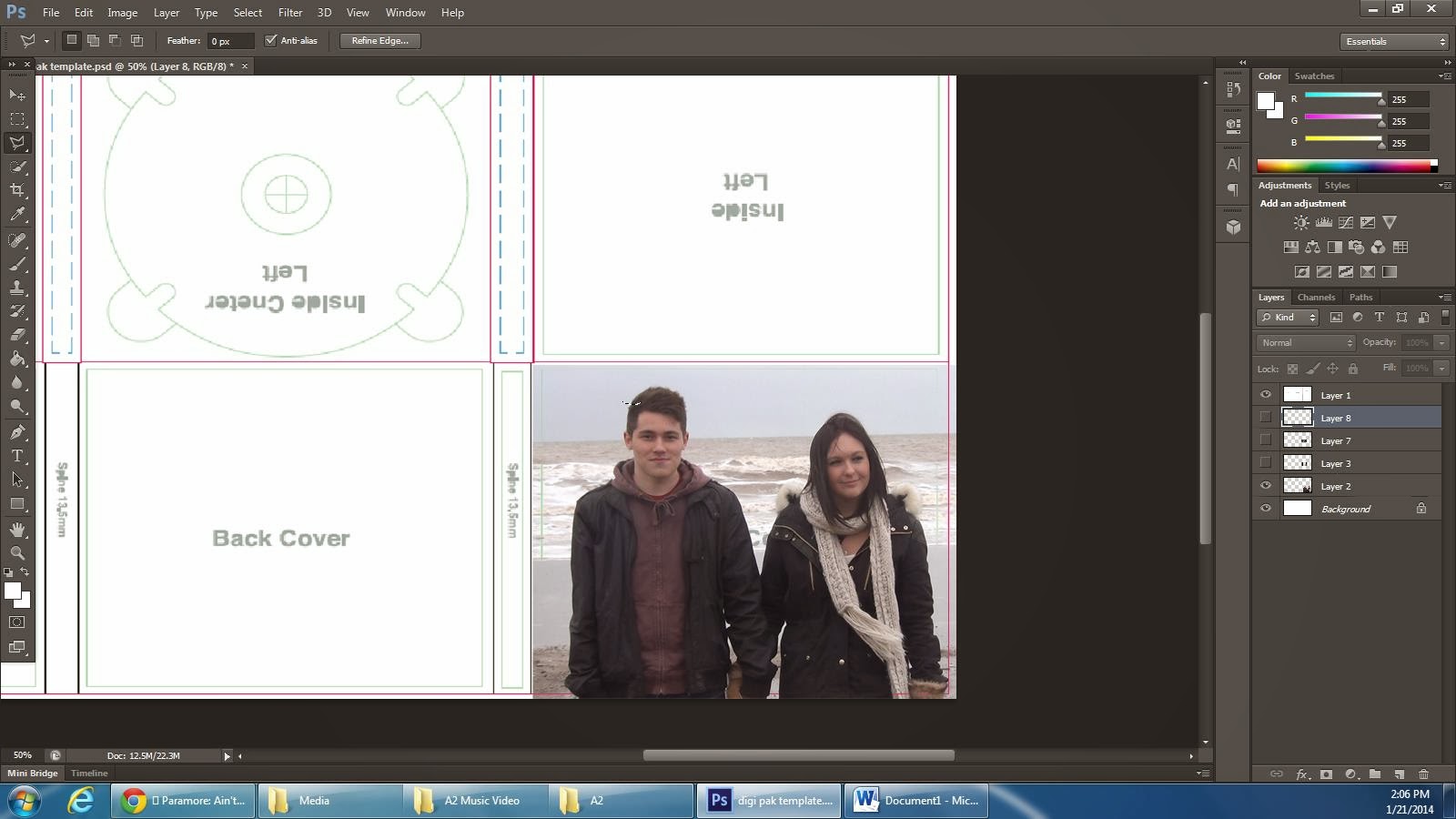
I looked at the typography Disclosure use and I tried to replicate this so it relates to my artists and is a convention on the genre. I used the font 'Tw Cen MT Condensed'. Its a very unique and powerful typography because the spacing is quite wide and this is to reflect the importance of each word. 


 I then decided to slightly change the font to make it more eye catching and stand out more. I have used the same font but the version that is more bold and defined. I have put the songs in this type because they are what I want to stand out as they are the main focus. Then I have put the featuring artists in that other type as they are not the main focus but they are still mentioned. 


Here I have created another layer and used a brush that when printed makes an image look battered and worn. From creating the right spacing and colour I can then place it on top of my image and make the 'Opacity' low and it will blend in and fade creating it to look old and worn. 

like so...


 I have also done the same process for the back image as the front image by adjusting the colour balance of the image. Gone into Image, then adjustments and then colour balance and found a similar balance to the front image.


I have began to edit the inside sleeves and I am just experimenting on what I can include inside.


New Ideas and Reflection On My Work So Far

From looking at my draft I did at Christmas time I am wanting to change a few things about my music video. This is because I think I can improve on certain things but I am finding time a difficulty. It is very hard to get my two actors for my video together at the same time, as we all have college and jobs.

First of all I'd like to change the concept of the continuity. My video right now is set in one day but then have flash backs of previous memories in it. Where as Id like to change it and make it in un-chronological order.( no order of time), just different memories and events that the couple did together. This way I think its more effective and engaging to represent the various happy memories they have had and gives a more reflective outlook on their happy relationship. It creates realism to because it shows their bond with each other and reflecting lots of happy memories reflects the necessity they have over each other, as it reflects they spend a lot of time together.

So I am going to do this by writing out various idea I would like to film and various shots of landscapes I could fit in their also.

Beginning:
I would like to involve the setting and scenery of the area. This will also link well with relating to my genre because Hull has some landscapes with graffiti on the wall for example, and this relates to the genre of music I have chosen. Shots of run down areas as it not only relates and is a convention of my genre but gives a sense of what type of place it is set in and what life style they live.

Other Ideas

I would like to film more meaningful things that reflect a deeper meaning, by linking the lyrics in with what I type of shot I make or angle ect. For example the lyrics 'Home is where the heart is, and I gave to you in a paper bag, even though its tarnished' is reflecting that her heart has been broken before and it is delicate, but she trusts him with it. I would like the emphasis this more because it a powerful line and is emphasizing the trust they have and how much they are in love. 

A major change I am making though is the continuity of my music video. I think it would be mush better if I reflected a lot of video clips of them together doing different things. It then gives the audiences a good reflection that thy have been together a very long time and how much they are in love. 

I am still going too keep some ideas I initially had, like the part where she looks into the book and it goes into a memory ( type of flashback) when she looks at the various images.

Friday, 24 January 2014

Ancillary Text: Process of creating my Digi Pak (Second Edit)


 From looking at the type of typography Disclosure has on their CD they have it is capitals and contrasting colours. The type is quite long and its type that is a genre convention of house music. I coloured the type in contrasting colours like they have done and to reflect the importance of the masthead.  


I then edited the image by clicking on image, adjustment and then colour balance. I created a mucky type of edit because there CD colour was represented like this. A type of retro and genre convention.


 Here is the tool that comes up which I then moved around to find the right colour balance.


This is my final edit for my Digi Pak Front cover. 


Thursday, 23 January 2014

Ancillary Text: Process of Creating my Digi Pak (First Edit)


These are the two images I have taken from my music video and I am going to use them in my Digi Pak. I chose these images as they are resembling the love and connection between each other and they are direct to the audience as they are looking into the camera.


From researching the artist I am recreating the music video for, Disclosure I found that have their own unique style which instantly relates to them, like their own personal logo. And that is this white stencil of a face below.  For all their posters, CD designs etc they have this logo presented over the face of the person. So I am going to do that on my Digi Pak to create realism in my Digi Pak to how it would be if sold. 

To create this face stencil I had to use the software Photoshop and the 'Polygonal Lasso tool' which helped me recreate this face design. I basically copied the stencil and then using the 'paint tool' I coloured it in white. 


Here I have placed it over my image and this is replicating the Disclosure design. Straight away the audience will know that it is the artist Disclosure as this image is very well known and significant to them.  This will be the front design for my Digi Pak but I still have more work to add to it. Such as typography and maybe some effects.


Tuesday, 21 January 2014

Research into Disclosure's CD

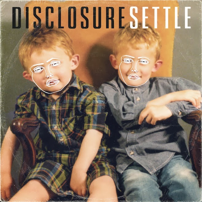
Here is the actual Cd cover and Back cover of their Album 'Settle'. I have decided to look at their CD covers so I can get an idea of the type of formal conventions they use. For example the typography, colours, angle and framing of the image etc. I found that they have a type of distinctive logo represented over the faces. This shows the audience straight away who the artist is without even needing a masthead to say who the artist it. It is a very distinctive image that represents the artist and has a meaning than just for display. It could be implying that their music is hypnotizing the audience listening. That it makes every have this type of personality turned on when the music comes on. 
There use of typography is very striking and has been reflected in 2 contrasting colours, black and white. This creates the mast head to leap out at the viewer as the contrasting colours make a pure statement. The artist disclosure is 2 brother who are DJ's and the image used on the front is showing that 2 young boys who are brothers.  The image is quite battered and worn a little, showing that its old and there's some aging. This can link in with the two boys are now grown up and this is an old image of them. Furthermore it links in with the conventions of the genre. House music genre conventions are reflected as retro, worn, and unique. For example graffiti is a genre convention for house as that's what is represented for this genre and I found this when I did my textual analysis. 


The back cover is very plain and simple but it gets the message across, the songs listed in this album. That is the main message as the background is very bland from the use of image and colour. The typography is in the colour white, which contrasts against the darker background. The writing is in capitals and this is clearly to make a statement and make them stand out more. They have an intro song for the first song on the CD and this is to introduce the listener to their album. Give them an idea what their music is about and what it sounds like. 


Thursday, 19 December 2013

Fireworks: Filming Day 2

I got Abi and Matt to come round to my house as I had the fireworks, a chimneyaire and quite a biggish garden, for enough space to let off fireworks. We began by getting the lighting and area all set out for filming. I put a few background lights on so it wasn't complete darkness and you could see what was happening on the video. I wanted the lighting to be dark so the main source of light was the one coming from the fire. The glow and the power of the fire links in with the passion and love they hold over each other. When filming the glow of the fire was reflecting onto the couple, showing that their love is so strong that they are glowing. Furthermore the colour of the flames (red/orange) link with love, passion and excitement., all the feelings they have.

 I then prepared the chimneyaire, which did take a few attempts to get alight. Eventually I got them to sit around the camp fire and toast marshmallows. I did this because I thought it was a nice mood and setting to place the couple in. Its a type of cute cliche thing a young couple in love do, e.g roasting marshmallows. I took different angles and shots to give a variety of choices and they relate to the mood and meaning I am trying to put across. For example a low angle to represent the audience looking up at the couple. That they are higher up from their happiness and emotion. Furthermore I always got the couple close to each other in the frame of my shot, to this is to represent the necessity they have over each other and they have to be close constantly , a strong bond is over them, drawing them together.

When lighting the fireworks I made sure everybody was stood back at a safe enough distance so nobody would get injured. I wasn't sure how long the fireworks where going to last so I just took one long shot but took different angles. So then when it comes to editing, I can cut it wherever and what bits I would like. I chose to have fireworks because the explosion can have a deeper meaning towards the couple. The feelings they get when seeing each other, is a type of explosion of emotion.

I did a lot of filming, so then when it comes to editing I can chose which bit I want to include in my music video. Furthermore Its so when I do the memory sequence at the end I have enough footage.